


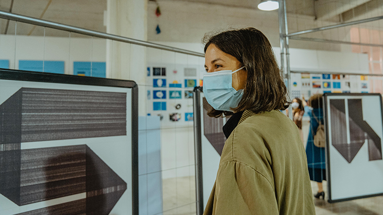
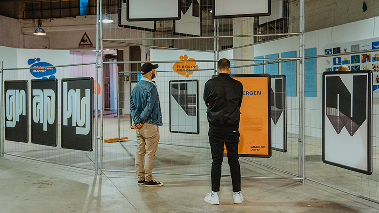
Exhibits

The Palace of Typographic Masonry
in partnership with Graphic Matters
Graphic Days® presents ‘An Alphabet of Cases’, a unique collaboration between Graphic Matters and The Palace of Typographic Masonry.
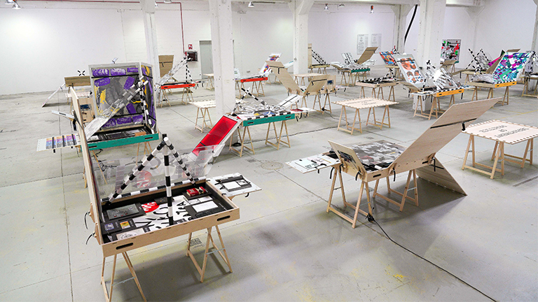
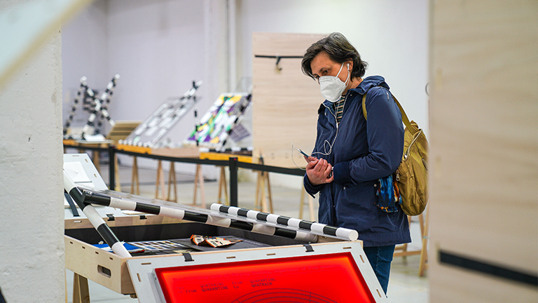
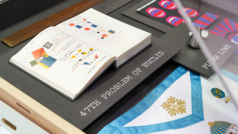
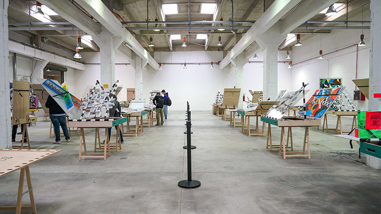
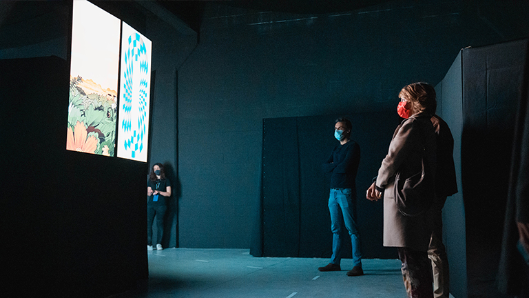
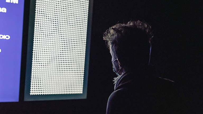
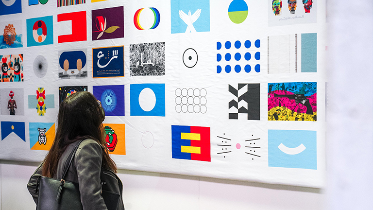
Wandering through The Palace of Typographic Masonry can be experienced as an immersion in the wonders of graphic design. Visiting the nine departments and their multitude of spaces feels like being initiated into an alternative design theory. Unfortunately, not everyone can visit this infinite building dedicated to the splendour and variety of graphic languages. That is why the Curator designed a traveling chest of drawers providing insight to this large collaborative project.
Each drawer houses a selection of physical objects connected to a particular space in The Palace of Typographic Masonry. The complete collection is disclosed by index cards on the transparent covers of the cases. Many commissioned pieces reflect on the spaces and travel along the gray inside of the lids.
This ‘alphabet of cases’ will be on display as part of ‘Graphic Days® – Eyes On the Netherlands’ in Turin. The presentation is generously supported by Graphic Matters, Gemeente Breda, Creative Industries Fund NL, Pictoright Fonds, the Embassy and Consulate of The Netherlands in Italy and Graphic Days®.
On Saturday, May 15 from 14:30 till 15:30 the exhibition curator and renown Dutch graphic designer Richard Niessen will be present for an exclusive guided tour. Book your ticket here.
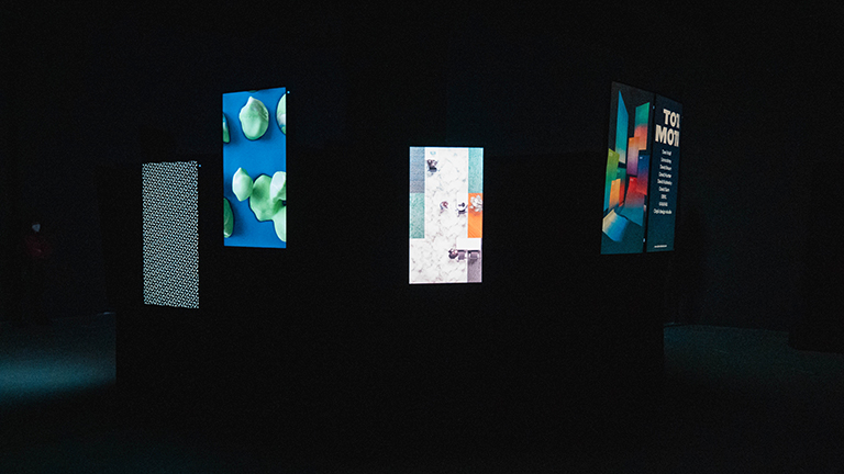
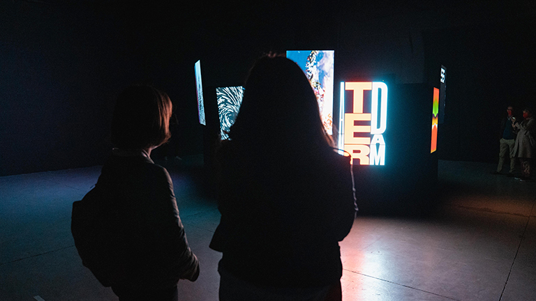
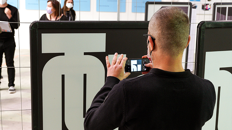
Demo Festival - Studio Dumbar
DEMO is founded by Studio Dumbar and Exterion Media Netherlands.
The inaugural DEMO festival took place on 7 November 2019 at Amsterdam Central station. The first festival of its kind, DEMO showcased the finest 400 motion artworks by 253 studios, designers, emerging talent and academies from more than 37 countries.
Studio Dumbar’s concept focused on a desire to celebrate exceptional motion design in a public space. With up to 250,000 people moving through the station every day, Exterion Media’s outdoor ad screens provided the perfect canvasses.
The identity is built around a variable typeface, the shape of which changes according to a self–developed script.
The festival was a huge success, inspiring new work by the world’s finest motion designers. In 2020 DEMO has won a D&AD Branding award, one of the most prestigious awards of design sector.
NL Branding - Studio Dumbar
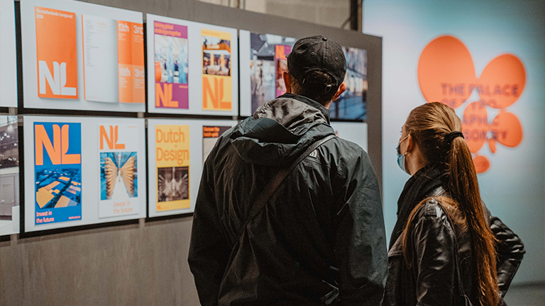
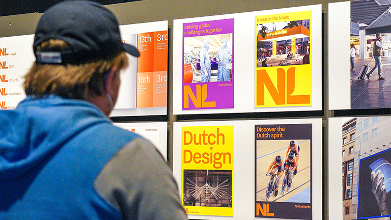
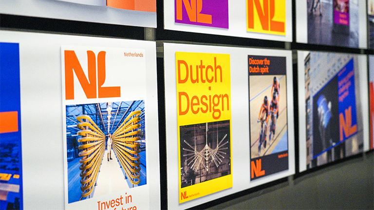
Seeking a new visual identity for the country, The Netherlands approached a Dutch studio with a proven record for creating brands that stand the test of time – Studio Dumbar.
The identity is used for international communications promoting Dutch organisations, companies and initiatives around the world. Simplicity, clarity and power. The new design draws on a well-known trinity: the colour orange, the tulip, and the NL acronym. All three are quintessentially Dutch, evoking an image that international audiences can recognise, while expressing qualities close to the hearts of the Dutch people. Based on the typeface Nitti Grotesk (created by Bold Monday), the NL logo – with its subtle reference to tulip petals – and accompanying logotype express a modern attitude, whilst communicating their message with absolute clarity.
Since 2020, a variety of organisations are gradually switching over to the new identity. Widely covered in the international design press and beyond – including international business bible, Forbes – the new branding succeeds in unifying what the nation has to offer on the international stage.
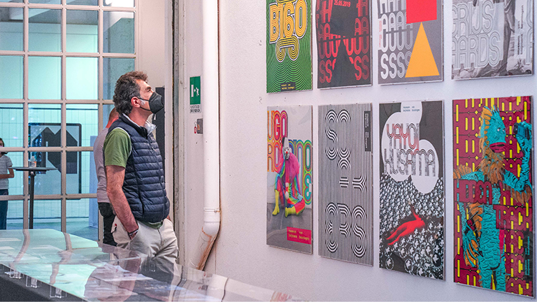
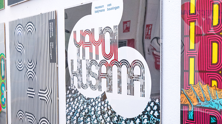
Daan Rietbergen
Daan Rietbergen (1988) is an independent graphic designer specialized in typography and poster design. He is based in Utrecht, The Netherlands. From 2014 to 2019 he worked as a visual designer at Studio Dumbar. His work is based on grids and systems. In his typographic projects the rules he imposes on himself sometimes outweigh the legibility. He sees letters almost as living characters that form one family, but also have the power to stand on their own. His typographic characters often appear in public space where they come to life even more.
Graphic Days® in collaboration with Graphic Matters and 3sec.gallery presents two series by Daan Rietbergen. Twenty-six posters showing the design process of the Nespor font. Ten other posters form two words set in the Rosdar font.
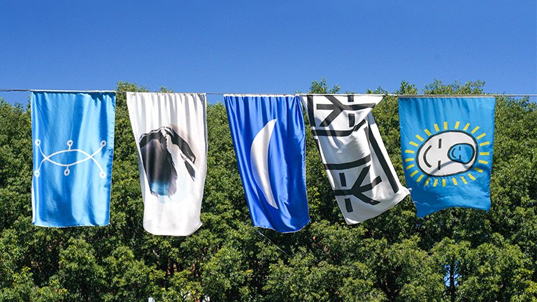
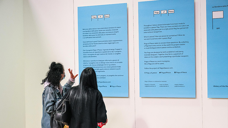
Flags of Peace - Trapped in Suburbia
Throughout history there have been several attempts to establish a peace flag. A universal collection of symbols exist that we associate with peace yet no single peace flag has gained complete international recognition and permanence. What defines peace? How could it be symbolised? And what must a peace flag achieve?
With the project, Flags of Peace, design agency Trapped in Suburbia seeks to answer these questions. The project aims to gather a flag design from every nation in the world. Through contributions from both established and young talented designers it creates a visual dialogue around peace and its symbolism. Together the flags present a global spectrum of ideas on peace, each highlighting particular relationships and views towards the topic.
Flags of Peace is a work in progress; more flags are still to come.
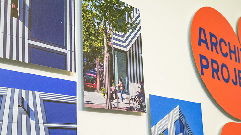
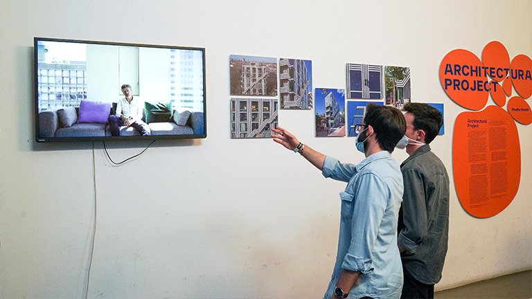
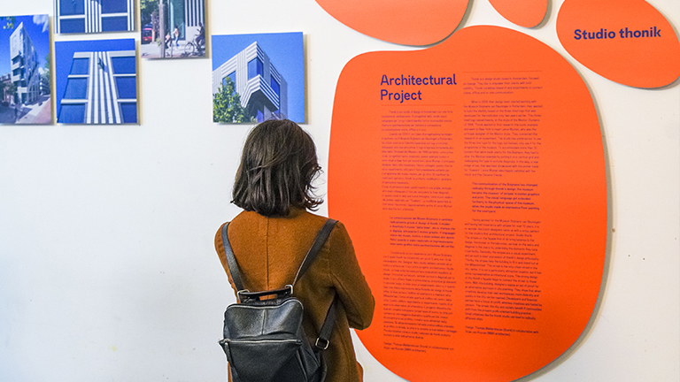
Architectural project - Studio Thonik
Thonik is a design studio based in Amsterdam, focused on change.
Having worked for the Museum Boijmans van Beuningen and having had experience with stripes for over 12 years, it is no wonder the Dutch designers came up with a stripy pattern for the studio’s first architectural project: Studio Thonik.
With this building, designers realize an act of proof for an alternative approach in city planning. They show that when creatives develop their own workspaces, more diversity and quality in the city can be reached. Small initiatives like the thonik studio can lead to radically different cities.